
 Brynne Krispin
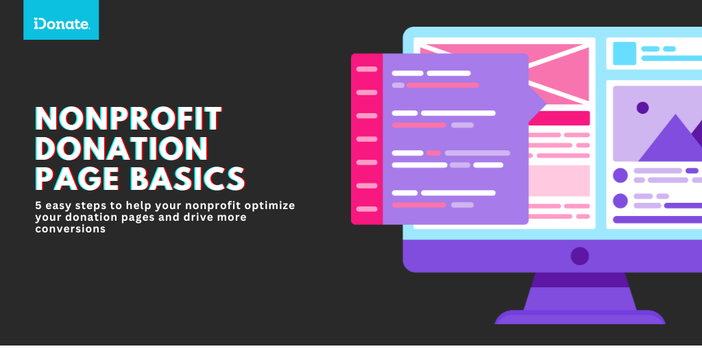
6 Ways to Optimize Your Donation Form and Increase Revenue
In the continuously growing trend toward digital fundraising, an organization’s donation form is its most invaluable resource. However, not all...
Product Spotlight

Mobile-First Pop-Up Donation Form
Launch mobile-first pop-up forms in minutes, use built-in tools to capture more donations, and optimize the giving experience—no dev team required.

The 4 Types of Online Donation Experiences
89% of donors leave without giving. Learn how to use the right donation form to close the gap and boost conversions.
As we approach the giving season, nonprofits everywhere are ramping up their digital fundraising efforts. But here’s one of the giving season tips that no one else is telling you: digital continuity is critical. Without it, even the best-intentioned campaigns can fall flat.
Imagine this: you’ve crafted a heartfelt social media post urging your followers to support your cause. It’s eye-catching, your message is strong, and you’re using the perfect call to action to lead people to your donation page. But when your supporters click that link, they land on a website that looks nothing like your social media post. The colors don’t match, the message feels different, and the donation form is confusing.

It’s like inviting someone to a party, only to change the address at the last minute. They might still show up, but chances are, many will get frustrated and turn away.
This disconnect between social media and the landing or donation page can cost you donations, engagement, and even long-term support. But with some attention to digital continuity, this can all be fixed—quickly.
Digital continuity is all about ensuring a seamless user experience from the moment a potential donor sees your social media post to the second they make a donation on your website. It means your paid and organic social media content matches your landing page and donation form in design, message, and tone. When a donor experiences a cohesive journey, they’re more likely to complete that donation.
Here are some stats to back it up:
When your social media campaigns don’t align with your giving campaigns, it sends mixed signals. This inconsistency can make supporters second-guess their decision to donate. It creates friction—and when donating feels hard, people often back out.
But the good news is, fixing digital continuity is easier than you think!
Let’s paint the picture:
Your nonprofit’s social media posts are vibrant and engaging, but your donation page feels flat and generic. The messaging on your landing page feels like it’s written by a different person. Your supporters are left wondering if they’ve even landed on the right page, and they’re unsure about where their donation will go.
Now, imagine this: your social media post seamlessly guides supporters to a landing page that feels like an extension of the post itself. The colors match, the message is crystal clear, and the donation process is smooth. Your audience can connect the dots effortlessly—from your post to their donation. They feel confident, reassured, and ready to give.
Even if your nonprofit doesn’t have a social media expert or a big budget, you can still implement digital continuity with a few simple steps. Here’s a checklist to make sure your digital campaigns stay aligned with your giving campaigns this season:
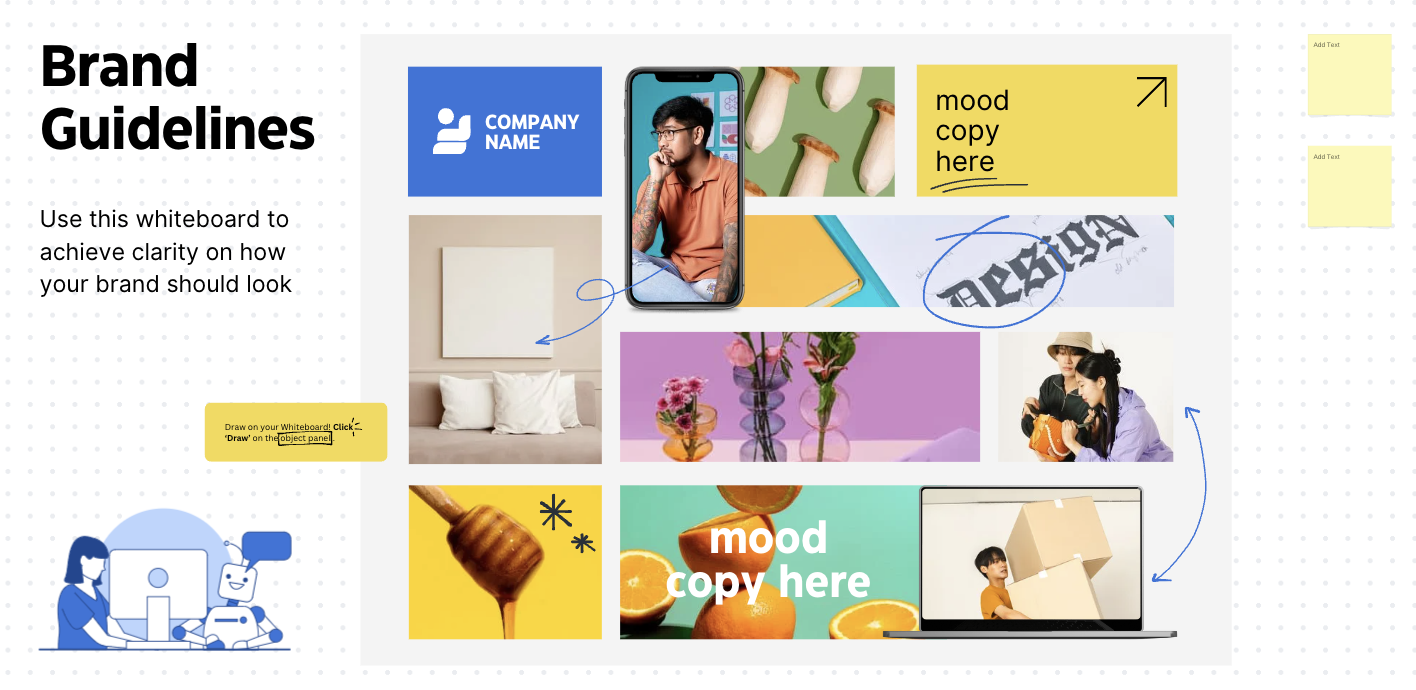
Before you launch your year-end campaigns, take a moment to visualize your digital continuity. I recommend doing a roll call across teams to collect all your year-end digital assets and display them side-by-side in one place.
One of my favorite tools to do this is Canva Whiteboards (pictured below) to easily create a live mockup of your campaign. Lay out your social media posts, ads, email designs, and landing page side-by-side. This simple exercise helps you see if your messaging, style, and design align across platforms. Invite 2-3 stakeholders to add their feedback, and update your whiteboard throughout the campaign building process.
Example of a Canva Whiteboard template
Ask yourself these three essential questions to determine if your campaign is cohesive:
As we head into the giving season, remember that digital continuity is a must-have. A cohesive, streamlined experience across your digital touchpoints will not only increase donations but also build long-term relationships with your supporters.
So, what’s the next step? Take a few minutes to review your current social media campaigns and donation pages. Make those quick fixes, align your messaging, and watch how much easier it is for your supporters to connect—and give.
Let’s make this giving season your most successful one yet!
About Brynne
Brynne is a social media strategist for NGOs and purpose-driven businesses.
Working with NGOs, thought leaders, and policymakers in DC for the last decade, she specializes in getting people to care about complex issues that might otherwise get ignored.
Her team at Cause Fokus uses empathy-based marketing to turn passive audiences into loyal advocates.
In the continuously growing trend toward digital fundraising, an organization’s donation form is its most invaluable resource. However, not all...
Your nonprofit organization should send text messages to donors this holiday season. You can reach people where they’re at, and it’s an incredibly...
Why Your Donation Page Matters More Than You Think Imagine this: a potential donor clicks through to your nonprofit’s donation page, ready to support...